Monday, June 7, 2010

Lab 8


The map 'Black Population' shows that the majority of Blacks live in the south. If you zoom in closely to counties that contain major cities, many of these also have a high percentage of blacks. However, the majority of blacks still live in the "Deep South", as has been a tend for a long time. There also seems to been a semi-ubiquitous spread across the rest of the nation.

The map 'Some other Race Population' shows what is most likely the dispersion of Latinos across the Continental United States. Latinos are mainly concentrated in the southwest, including Los Angeles county. This makes sense because of the proximity of these states to Latin America. Some counties seem to be anomalies and have high Latino populations in regions where surrounding counties do not. There is not enough data to explain why this could be though.

The map 'Asian Population' shows that the majority of Asians are concentrated along the west coast, and mainly in California and Washington. The Bay Area has a few of the highest percent Asian counties in the nation (San Francisco, San Mateo, and Alameda). Asians have by far the least dispersion of the three races as they are mainly concentrated in a certain area, and mostly absent in other parts of the country excluding major cities.

I think the census map data is really interesting because I think population statistics on race, wealth, age, and other features are very interesting. It can lead to a lot of interesting questions about why things are the way the are. In respects to GIS, I've really enjoyed the labs in this class. I think ArcGIS is a great program, and I think the maps that it can create are fun, interesting, and can also be extremely useful in analyzing a problem.

Tuesday, May 18, 2010

Lab 7


In this map, I show how the LA County wildfires affect the population and landmarks of Los Angeles County. Landmarks include schools, parks, building, famous locations, etc. I think this an important issue because, while it is unfortunate that wildfires are burning in the wilderness, it's much worse if they are burning in downtown Los Angeles.

I added the major highways (Los Angeles County Major Highways) of Los Angeles because I think it helps as a reference point to where certain locations are in Los Angeles. From looking at the most major highways (1, 10, 405, 101, etc), it is clear that most of them will not be affected by the fires. This means that there will not be huge traffic problems because of road closures. However, the major road that goes into the national forest will clearly be affected.

The population of Los Angeles County is 9,862,049 (Los Angeles County, California). Los Angeles' population is mostly condensed into the Southern part of the county, however, there are definitely some people who are directly affected by the fires. I added population density (Los Angeles County Census Urbanized Areas) because I think it's important to examine if the fires are burning next to a scarcely population area, or a densely population area. The map shows that the fires are mostly burning around less population areas.

I included landmarks (Los Angeles County Large Area Landmarks) to show how businesses and schools could be affected. If the fires force school closures or amusement park closures, that would adversely affect Los Angeles' economy. If the fires are threatening certain areas that have a lot of landmarks, it may influence where the fire department decides to fight the fire. Similar to population density, the fire threatens some landmarks, but it is burning in an area that does not have a lot of landmarks.

This fire seems to have started in a national park (Los Angeles County Major Parks). This makes sense because there is a lot of fuel for a fire burn in a national park. While it is unfortunate that there is a fire in the first place, this fire is less devastating than other fires that have burned in heavily population areas, like the Oakland Hills Fire in 1992.

Citations:
"Los Angeles County Major Highways". FGDC, ESRI Metadata. May 25, 2010 .

"Los Angeles County, California". Wikipedia. May 25, 2010 .

"Los Angeles County Census Urbanized Areas". ESRI. May 25, 2010 .

"Los Angeles County Large Area Landmarks". ESRI. May 25, 2010 .

"Los Angeles County Major Parks". ESRI. May 25, 2010 .

Tuesday, May 11, 2010

Lab 6


The area that I selected is the part of the Oakland Hills that is close to my house, along with one of the bridges in the bay area. I think this area is interesting because it shows zero elevation as well as 580 meter elevation. I think the sharp change in elevation creates an interesting map. In decimal degrees, the map extends from 38.0606 to 37.7298 degress North-South, and -121.9992 to -122.4139 degrees East-West. The spatial reference is GCS North American 1983 and the Datum is D North American 1983.

Monday, May 10, 2010

Week 6: Map Projections

Map projections are important because it is the main way that we familiarize ourselves with how the world looks. Most people do not use 3-D projections of the world when referencing distance or area, so it is important to understand how different maps are distorted so one doesn't believe that what they are looking at is exactly how the earth looks.

Conformal projections like the Stereographic or Mercator projection are nice because they map the earth on a grid which makes allows us to make UTM maps and is easier to split into segments. However, they also heavily distort some areas and also can alter the actual distance between two locations.

Equidistant projections are very useful for distance related subjects, which apply to a wide range of people. Governments may use equidistant maps for missile defense or people may use equidistant maps when figuring out how far they want to hike. The downside with equidistant maps is that they are also distorted, especially the area. In the Plate Carree projections, Alaska looks to be the size of Brazil, and in the Sinusoidal projection, Alaska is barely visible. In you grew up only looking at these two projections, you would either think Alaska was much bigger than it was or be unaware of Alaska.

Equal area projections are good for an overall picture about the relative size of objects. The Mollweide and Bonne projection are not projected too oddly (in comparison to some of the other equal area projections). However, these maps are not easy to manipulate to form something like quadrangles or very useful in measuring distance.

Any projection alone is not sufficient for portraying everything that needs to be, however, certain maps can serve certain purposes, and a combination of maps can fulfill all of our needs for accuracy and convenience.

Monday, May 3, 2010

Week 4 Lab


I thought the guide that went along with ArcGIS made using it for the first time very easy. The program seems intimidating at first glance because it's kind of hard to figure out where to start, however, the guide was extremely detailed and didn't leave out any of the nuances for any of the steps. By the end of the process, I felt comfortable doing the basics of ArcGIS, and could get through the more advanced steps without too much difficulty as well.

What really impressed me about this program is how easy it was to create a simple poster that you could show to someone who isn't familiar with the technical jargon of GIS. By the end of the lab, the final product is a simple graph that anyone could understand. I think this is very important because a lot of the people who would be making decisions based on a GIS map could be confused by a more complicated depiction.

I think one of the potential pitfalls of this program could be that it is not as interactive as it could be. Maybe we haven't gotten far enough into the program and you are able to do more interactive stuff, but if you can't, I think programs like Google Maps will always be more useful for some things because of how accurately they can portray the real world. If there was some way to make the maps a little more 3-D, I think that could be an improvement.

Overall, the program is very impressive. Obviously overtime the program will improve because all technology does, but even as it stands, the program is good at creating maps. I think that in going forward and learning how to better utilize the more intricate tools of the programs, I will find ways to do more of the things I want to with this program.

Monday, April 19, 2010


View Barry Bonds Home Run Locations in a larger map


Neogeography is interesting because with the technology available now, anyone can make a pretty interesting map. This is good for a number of reasons. One is that some information may not be viewed as important enough to map by organizations who do cartography for a profession. For example, a company may not want to spend the time mapping the locations of bakeries in Berkeley, but the people of Berkeley may really appreciate this map. Neogeography provides people with the tools and the internet provides people with information and used together they can create some very useful maps.

There is a definite downside to Neogeography in the fact that there are no quality standards for maps. One of the nice things about the maps provided by the government is that you know they are reliable and have been designed thoroughly, but with Neogeography you never know how reliable the maps are. The maps may also be too influenced by people's personal preferences, and may also be flat wrong. However, I don't think that these downsides are enough to not do Neogeography, but rather points that should be taken into consideration going forward in Neogeography.

Tuesday, April 6, 2010

Lab # 2

1. The name of the quadrangle is Beverly Hills.
2. The names of the adjacent quadrangles are Gonoga Park, Van Nuys, Burbank, Topanga, Hollywood, Venice, and Inglewood.
3. The map was first created in 1966.
4. The horizontal datum used to compile this map was NAD 27, the vertical datum used is National Geodetic Vertical Datum of 1929.
5. The scale is 1:24000
6. a) D=24000cm x 5=1200 meters
b) D=24000in x 5 =1.894 miles
c) D=63360in/24000=2.64 ind) D= 300cm/24= 12.5 cm
7. The contour interval is 20 ft.
8. a) The longitude is 118 deg 26' 58" and the latitude is 34 deg 4' 15". The decimal longitude is 118.449497 and the latitude is 34.071074.
b)The longitude is 118 deg 29' 52" and the latitude is 34 deg 00' 31". The decimal longitude is 118.4978 and the latitude is 34.0086
c)The longitude is 118 deg 24 ' 37" and the latitude is 34 deg 07' 10". The decimal longitude is 118.4102 and the latitude is 34.1194
9. a) The elevation is 560 ftb) The elevation is 140 ft
c) The elevation is 620 ft10. Zone 11
11. 3763000 meters North and 361500 meters East
12. There are 1,000,000 sq meters in each cell.
13.
14. 14 deg
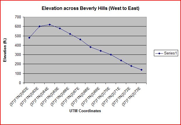
15. The intermittent stream is flowing from North to South
16.

Tuesday, March 30, 2010

Lab #1


This map shows the regional alliance to certain baseball teams in America. I think it is interesting because some teams have large areas (Twins or Blue Jays) but have attendance problems while teams like the Giants or Angles have smaller areas, but do not have a problem selling out games. This shows that it is more useful for a team to have a dense population of fans rather than a less dense but larger area.


This map shows which Presidential Candidate won which county in the 2008 election, with blue representing Barack Obama and red representing John McCain. I think it is interesting because if you only looked at this map, you would assume McCain had won because red dominates the map. However, many of the counties McCain won were scarcely populated while Obama won in more dense counties. This map shows a political disparity between rural and urban regions.


The source of this map is http://www.eightmaps.com/
This map shows the location of people that donated money to the Yes on Prop 8 campaign, the campaign that successfully banned same sex marraige in California in 2008. I think this map is interesting for a number of regions. One is that someone donated to the Yes on 8 campaign who lives at Market and Castro, literally in the center of the gay area of San Francisco, and I'm curious why they would choose to live there. Another interesting thing about this map is that the young professionals who make up a large portion of the South of Market population donated almost no money to the Yes on 8 campaign, while other wealthy areas donated a lot of money. It is an interesting way to compare social views among different populations of people in a city.