Monday, April 19, 2010
View Barry Bonds Home Run Locations in a larger map
Neogeography is interesting because with the technology available now, anyone can make a pretty interesting map. This is good for a number of reasons. One is that some information may not be viewed as important enough to map by organizations who do cartography for a profession. For example, a company may not want to spend the time mapping the locations of bakeries in Berkeley, but the people of Berkeley may really appreciate this map. Neogeography provides people with the tools and the internet provides people with information and used together they can create some very useful maps.
There is a definite downside to Neogeography in the fact that there are no quality standards for maps. One of the nice things about the maps provided by the government is that you know they are reliable and have been designed thoroughly, but with Neogeography you never know how reliable the maps are. The maps may also be too influenced by people's personal preferences, and may also be flat wrong. However, I don't think that these downsides are enough to not do Neogeography, but rather points that should be taken into consideration going forward in Neogeography.

Tuesday, April 6, 2010
Lab # 2
1. The name of the quadrangle is Beverly Hills.
2. The names of the adjacent quadrangles are Gonoga Park, Van Nuys, Burbank, Topanga, Hollywood, Venice, and Inglewood.
3. The map was first created in 1966.
4. The horizontal datum used to compile this map was NAD 27, the vertical datum used is National Geodetic Vertical Datum of 1929.
5. The scale is 1:24000
6. a) D=24000cm x 5=1200 meters
b) D=24000in x 5 =1.894 miles
c) D=63360in/24000=2.64 ind) D= 300cm/24= 12.5 cm
7. The contour interval is 20 ft.
8. a) The longitude is 118 deg 26' 58" and the latitude is 34 deg 4' 15". The decimal longitude is 118.449497 and the latitude is 34.071074.
b)The longitude is 118 deg 29' 52" and the latitude is 34 deg 00' 31". The decimal longitude is 118.4978 and the latitude is 34.0086
c)The longitude is 118 deg 24 ' 37" and the latitude is 34 deg 07' 10". The decimal longitude is 118.4102 and the latitude is 34.1194
9. a) The elevation is 560 ftb) The elevation is 140 ft
c) The elevation is 620 ft10. Zone 11
11. 3763000 meters North and 361500 meters East
12. There are 1,000,000 sq meters in each cell.
13.
 14. 14 deg
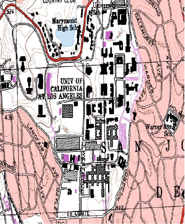
15. The intermittent stream is flowing from North to South
16.


2. The names of the adjacent quadrangles are Gonoga Park, Van Nuys, Burbank, Topanga, Hollywood, Venice, and Inglewood.
3. The map was first created in 1966.
4. The horizontal datum used to compile this map was NAD 27, the vertical datum used is National Geodetic Vertical Datum of 1929.
5. The scale is 1:24000
6. a) D=24000cm x 5=1200 meters
b) D=24000in x 5 =1.894 miles
c) D=63360in/24000=2.64 ind) D= 300cm/24= 12.5 cm
7. The contour interval is 20 ft.
8. a) The longitude is 118 deg 26' 58" and the latitude is 34 deg 4' 15". The decimal longitude is 118.449497 and the latitude is 34.071074.
b)The longitude is 118 deg 29' 52" and the latitude is 34 deg 00' 31". The decimal longitude is 118.4978 and the latitude is 34.0086
c)The longitude is 118 deg 24 ' 37" and the latitude is 34 deg 07' 10". The decimal longitude is 118.4102 and the latitude is 34.1194
9. a) The elevation is 560 ftb) The elevation is 140 ft
c) The elevation is 620 ft10. Zone 11
11. 3763000 meters North and 361500 meters East
12. There are 1,000,000 sq meters in each cell.
13.
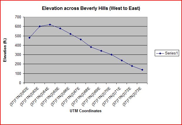 14. 14 deg
15.
The intermittent stream is flowing from North to South16.
Tuesday, March 30, 2010
Lab #1

The source of this map is http://strangemaps.files.wordpress.com/2007/08/835641802_ef422b12cf_b1.jpg

This map shows the regional alliance to certain baseball teams in America. I think it is interesting because some teams have large areas (Twins or Blue Jays) but have attendance problems while teams like the Giants or Angles have smaller areas, but do not have a problem selling out games. This shows that it is more useful for a team to have a dense population of fans rather than a less dense but larger area.

The source of this maps is http://kevinschulke.files.wordpress.com/2008/11/2008_election_map.jpg

This map shows which Presidential Candidate won which county in the 2008 election, with blue representing Barack Obama and red representing John McCain. I think it is interesting because if you only looked at this map, you would assume McCain had won because red dominates the map. However, many of the counties McCain won were scarcely populated while Obama won in more dense counties. This map shows a political disparity between rural and urban regions.

The source of this map is http://www.eightmaps.com/
This map shows the location of people that donated money to the Yes on Prop 8 campaign, the campaign that successfully banned same sex marraige in California in 2008. I think this map is interesting for a number of regions. One is that someone donated to the Yes on 8 campaign who lives at Market and Castro, literally in the center of the gay area of San Francisco, and I'm curious why they would choose to live there. Another interesting thing about this map is that the young professionals who make up a large portion of the South of Market population donated almost no money to the Yes on 8 campaign, while other wealthy areas donated a lot of money. It is an interesting way to compare social views among different populations of people in a city.
Subscribe to:
Posts (Atom)